Thomas Cook

Website

Thomas Cook screenshots

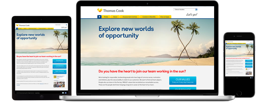
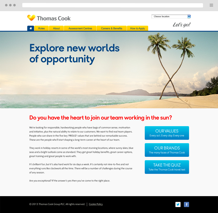
I’ve worked on several re-designs of Thomas Cook’s site for recruiting holiday reps across Europe. The main goals were to apply new branding, incorporate messaging from an advertising campaign and ensure the site worked in multiple languages.

My main involvement was developing a new site architecture and user journey, designing the user interface and page templates, as well as helping with the front-end development.
Information Architecture

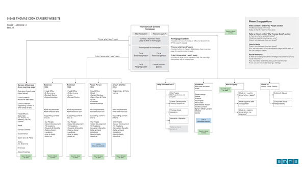
The IA evolved from the previous site to accommodate new content and job categories. A landing page was used to choose country and language, then a clear distinction was made between the main types of content: role categories, supporting information and the application process.

User Journey

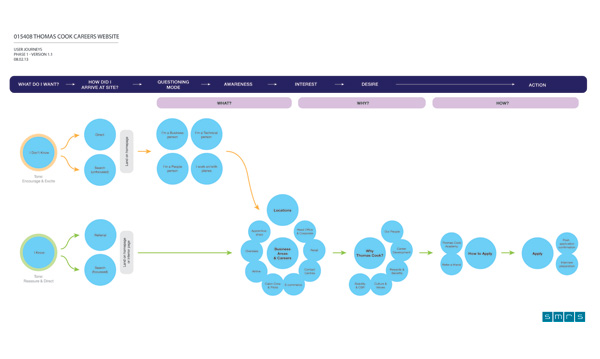
The user journey was key to enabling people to find a suitable role in a country of their choice. They’d need access to supporting information that would allow them to make an informed decision and strong application. Clearly labelled navigation and call-to-actions were used to aid this.

View more projects

Interested in working with me?